Overview
Component name: Header
Authors who can use: admin only
Templates/page types that can use component: all
Required or optional: required
Authoring Fields
Creating a new Header Experience Fragment
There is only one Header for PA.gov, which has already been created. In nearly all circumstances, Admins should edit the existing version, rather than create a new one. To edit, skip to “Editing the Header Experience Fragment- in general” section below.
For testing purposes, the steps to create a new Header are below.
- From the landing Navigation page, click on Experience Fragments.

2. To create a new Header XF, click through the folders of the site that needs a Header. In this example, that folder is CoPA PWP PAGov Fragments. Click on the language folder, then “Global.”
3. Click “Create” and “Experience Fragment” from the top right menu.

4. On the Create Experience Fragment page, click “Web Variation,” then “Next.”
5. Add a title, then click “Create.”
6. Click “Open.” The XF editing page will open in a new tab.
7. Hover over "Drag components here" so it highlights blue. Click the plus sign. From Insert New Component, select Side Navigation.
8. Once created, Sapient will set the Header to appear on all pages.
Adding the Header Experience Fragment to the page
The Header is built into all AEM-managed PA.gov pages. It appears at the top of pages by default.
Editing the Header Experience Fragment- in general
1. From the landing Navigation page, click on Experience Fragments.
2. To edit the main PA.gov Header, click on CoPA PWP PAGov Fragments folder.
1. To edit another Header, such as the Web Content Management (WCM) site, click on that site’s folder and follow the same directions below.
3. Click through the folders until “Header” is reached. Click the checkbox, then click “Edit” from top navigation.

4. On the screen is the Edit page, with only the Header displayed. Editing the Header here will affect the Header on all PA.gov pages.
Editing the Header Experience Fragment - Banner + Navigation Bar
1. Hover over the blue outline of the Header. With the edit wrench, open the component.

2. Banner tab
- Banner Image field: Use the folder to find the correct banner image in the DAM. This image will appear in the Banner.
- Banner Image Alt Text field: Add alternative text for accessibility.
- Modal Label field: Add text that will display as the link label for the Modal. This text will be blue and underlined, and will open the Modal when clicked.
- Modal Name field: Add the name of the Modal as created in the Modal component. Reference the Modal user guide for more details.
- Banner Text field: Add text that will display as the text for the rest of the banner. This text is not clickable.

3. Navigation Bar tab
- Logo Image field: Use the folder to find the correct logo image in the DAM. This image will appear in the Navigation Bar.
- Link URL field: When users click on the logo image, they will be taken to this link. It should be the site's homepage. Use the folder to find the page within AEM.
- Logo Image Alt Text field: Add alternative text for accessibility.
- Enable Search checkbox: When checked, displays the Quick Search bar. Default checked.
- Enable Language Selector checkbox: When checked, displays the language selector feature. Default unchecked.
- Enable Profile Management checkbox: When checked, displays the profile management feature. Default unchecked. Post-MVP feature; not currently available.

Editing the Header Experience Fragment - Navigation Menu
1. Hover over the blue outline of Navigation Menu. With the edit wrench, open the component

2. Navigation Menu
- Navigation field: Add either a dropdown label or a button label. A dropdown label has multiple links underneath, while a button is a standalone link. Text entered in this field will display on the Navigation Menu.
- A dropdown labeled “Benefits & Services” shows multiple links underneath when clicked.
- A button labeled “Your Government” is a standalone link.
- If adding a dropdown label, continue to step 3, Group Heading. If adding a button label, continue to 2.1 below.
- Add URL for button label field: Add the link for the button. Use the folder to find a page within AEM, or copy/paste an external link.
 Figure A: Buttons authored in Navigation Menu will send residents to the "Services" and "Agency Directory" pages
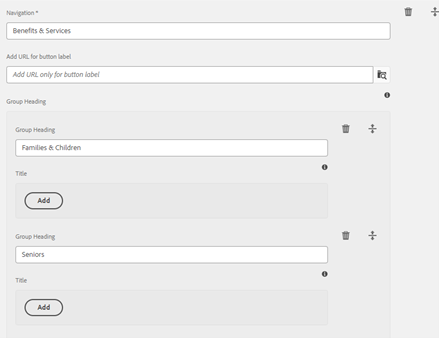
3. Group Heading multifield: Add a Group Heading to appear below the dropdown. Group Headings are not clickable. They help organize content if a dropdown has multiple subjects.
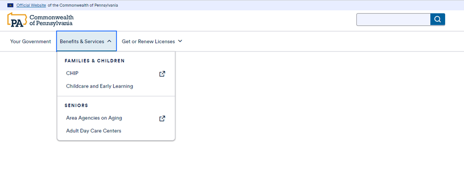
1. Example: a dropdown labeled “Benefits & Services” has the Group Heading “Families & Children” and the Group Heading “Seniors.” Each Group Heading has additional links below.
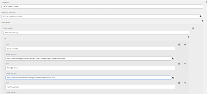
2. Note that Group Headings are optional. Authors may skip the Group Heading and go straight to step 4.
 Figure B: Benefits & Services dropdown will have two Group Headings, as the fields were filled.
 Figure C: Get or Renew Licenses dropdown will not have Group Headings, as the field was left blank.
4. Under Title, click Add.
5. Title field: Add a title label. This appears in the dropdown as clickable text.
6. Add URL for Title field: Add the link that the title will lead to. Use the folder to find a page within AEM, or copy/paste an external link.
 Figure D: Titles under the "Your Government" dropdown lead residents to "The Governor" and "Lt. Governor" pages.
7. Continue adding Titles to the same Group Heading until done.
8. Continue adding Group Headings to the same Navigation dropdown, repeating steps 2-7, until done.
9. Continue adding Navigation dropdowns and buttons, and repeating steps 1-8, until done.
Navigation Menu Examples
 Figure E: Navigation Bar as it appears in the Header.
 Figure F: Benefits & Services dropdown, which features two Group Headings.
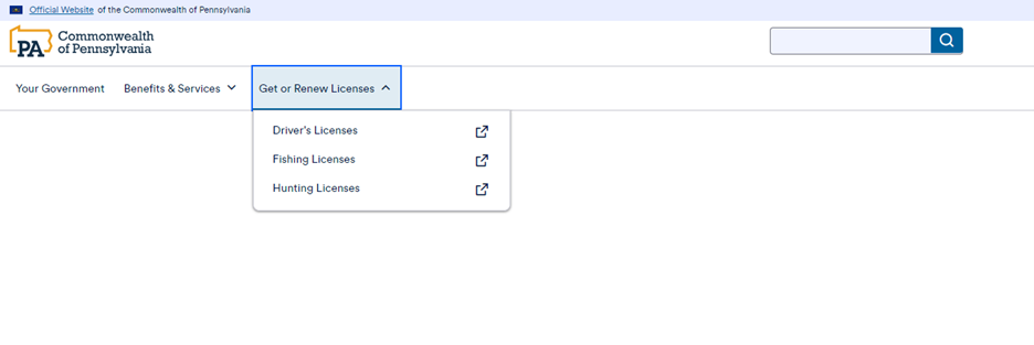
 Figure G: Get or Renew Licenses dropdown, which features no Group Headings.
Accessibility
- Landmark regions have been built into the Header to allow residents with assistive technologies to quickly move through the Header options.
- Keyboard support has been built into the Header to move keyboard focus across the Navigation Menu.
Other tips
- Use the Emulator widget to test Header size on different devices.
- There is no max number of dropdowns/buttons on the Navigation Menu.
- Group Headings are not clickable links.
- Links can be internal or external. External links have an external icon, and will open a new tab when clicked.
