
Overview
Component name: Title
Authors who can use: any
Templates/page types that can use component: all
Required or optional: optional
Authoring Fields
Adding the Title component to the page
Once on the desired page in Edit mode, add the Title by doing the following:
Option 1: Double click on “Drag components here.” A modal titled “Insert New Component” will pop up. Type “Title” in the search bar, or scroll to the Title in the list. Double click to add to page.
Option 2: On the left hand rail, navigate to the Components tab. Type “Title” in the search bar, or scroll to the Title in the list. Double click to add to page.
Note that the Title automatically defaults to the Small display size and h2 type size. Both can be edited.
Editing the Title component
1. With the edit wrench, open the component.

2. Properties Tab
a. Title field: Edit the Title text. The text in the Title automatically defaults to use the page title; it can be changed here.
b. Type / Size dropdown: Edit the H-level of the Title. This does not affect the display size, but is instead used for accessibility purposes. Make sure the H-level reflects the item’s priority on the page (ex. h2 for section headers, h3 for sections that fall under h2, etc.). Default: h2.
c. Link field: Optionally add a link to the Title. Links may be internal, external, or anchor links. Read more about anchor links in the user guide.
i. Open link in new tab checkbox: If checked, opens link in new tab. Default unchecked.

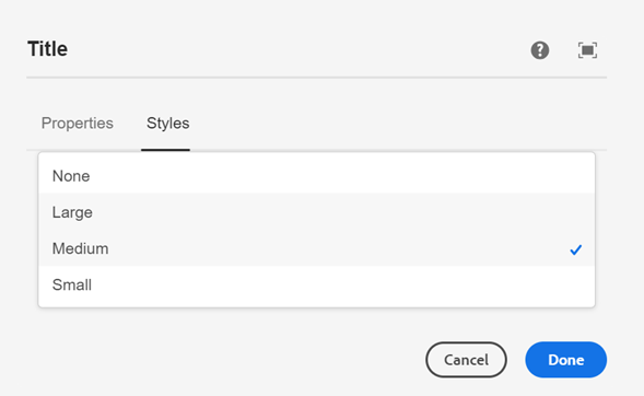
3. Styles tab
- Select display size of title dropdown: Edit the display size of the Title. Choose between Small, Medium, and Large.
- Note that in the dropdown, None will show checked by default. This is due to an AEM page property setting. The display size is by default set to Small, despite None being checked.
- When selecting display size, do not select the None option, as it has no styling applied.
- Title alignment dropdown: Edit the alignment of the Title. Choose between Left and Center.
- Note that in the dropdown, None will show checked by default. This is due to an AEM page property setting. The alignment is by default set to Left, despite None being checked.
- When selecting alignment, do not select the None option, as it has no styling applied.
- Note that in the dropdown, None will show checked by default. This is due to an AEM page property setting. The alignment is by default set to Left, despite None being checked.

The display size can also be edited directly from the Edit Toolbar.
- Select the paintbrush.
- Choose between Small, Medium, and Large.
- Note that in the dropdown, no size is checked by default. The display size is set to Small, despite no size being checked.
Accessibility
- Display size is separated from H-level so as to edit the look and feel without compromising the Title’s accessibility and SEO. Take care when changing display size so that residents understand how each section of the page relates to the next.
- Provide descriptive section titles that are easy to understand. Reference the Style Guide for more information.
Other tips
- Use the Emulator widget to test Title size on different devices.
- The Title has a maximum width. Once met, text will wrap to another line.
- It is not recommended that a nested Title’s size be increased to match a higher ranked Title. However, changing a nested Title’s size to match a lower ranked Title is typically okay.