
Overview
Component name: Text
Authors who can use: all
Templates/page types that can use component: all
Required or optional: optional
Authoring Fields
Adding the Text component to the page
Once on the desired page in Edit mode, add the Text by doing the following:
Option 1: Double click on “Drag components here.” A modal titled “Insert New Component” will pop up. Type “Text” in the search bar, or scroll to the Text in the list. Double click to add to page.
Option 2: On the left hand rail, navigate to the Components tab. Type “Text” in the search bar, or scroll to the Text in the list. Double click to add to page.
Editing the Text component- full authoring dialog
1. With the edit wrench, open the component.
2. The RTE opens as a modal. Click “Toggle Fullscreen” in the upper righthand corner for a wider view. Options are truncated in the modal view.
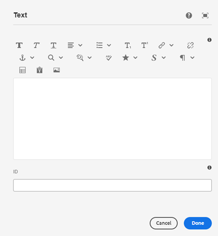 Figure A: Authoring dialog, modal view.
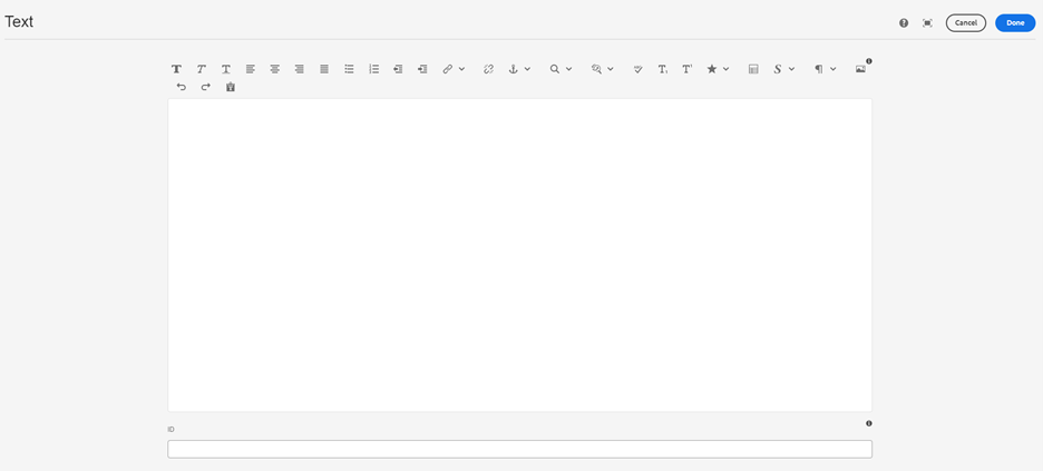 Figure B: Authoring dialog, fullscreen view.
Options within RTE (left to right) as seen in modal view
- Bold- bold text
- Italics- italicize text
- Underline- underline text
- Justify- left, center, or right align text
- Bullet point list- bullet point list, numbered list, left indent, right indent
- Subscript- add subscript to text
- Superscript- add superscript to text
- Hyperlink- add link to text, to link users to another page. See Hyperlinks user guide for more info.
- Do not add alternative text to hyperlinks.
- Unlink- remove link from text
- Anchor link- add anchor links to the text, to link users to content on the current page. See Anchor Links user guide for more info.
- Magnifying glass- search for occurrences of a word or phrase in the RTE
- Find and replace- find and replace text, either in individual instances or all instances
- Spellcheck- underline misspelled words/grammar mistakes
- Special characters- add special characters to text
- Style: headline/body display size- denote parts of the text as either headline or body text, and size them as Small, Medium, Large. This does not impact heading level.
- Popover can be added here. See Popover user guide for more info.
- Paragraph/heading level- change the heading level (H-level) of the text, add a horizontal line, or add quote styling.
- Quotes can be added here. See Quote user guide for more info.
- Table- insert a table. Specify columns, rows, border, caption, and spacing, if desired. See Table user guide for more info.
- Paste as text- paste any copied text, in the style of the Text component (rather than the style as copied)
- Image- insert an image. Do not use; images should be added through the Image component to ensure accessibility. See Image user guide for more info.
- Undo- undo the last action
- Redo- redo the last action that was undone
- Paste as text- paste copied text
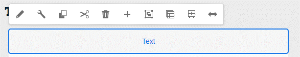
Editing the Text component- abridged authoring dialog
1. With the pencil wrench, open the component.
2. An abridged authoring dialog opens. Use the options to edit text directly on the page, without opening the authoring modal.
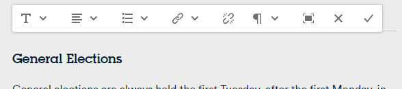
3. If more options are needed, click the fullscreen icon (third from right) to open the full authoring modal.
Accessibility
- Hyperlinks should not contain alternative text. It is redundant for screen readers. Leave the alternative text field blank.
Other Tips
- Use the Emulator widget to test Text size on different devices.
- Aim to pair styles from the same size group. For example, if using “Headline – Large” for a heading, pair it with “Body – Large” for the body text.