
Overview
Component name: Social Media
Authors who can use: all
Templates/page types that can use component: all as part of Footer; otherwise any page templates
Required or optional: required as part of Footer and Agency News Article; other uses are optional
Authoring Fields
Adding the Social Media component to the page
1. Once on the desired page in Edit mode, add the Social Media component by doing the following:
a. Option 1- double click on “Drag components here.” A modal titled “Insert New Component” will pop up. Type “Social Media” in the search bar, or scroll to Social Media in the list. Double click to add to page.
b. Option 2- on the left hand rail, navigate to the Components tab. Type “Social Media” in the search bar, or scroll to Social Media in the list. Double click to add to page.
2. Note that the Social Media component in the Footer is added to all pages by default as an Experience Fragment. It can only be edited by site admins. If edited, the change will take place across all pages with the XF.
3. Note that the Social Media component in each agency's Agency News Article template is added by default as an Experience Fragment (XF). If edited, the change will take place across all pages with the XF.
Editing the Social Media component
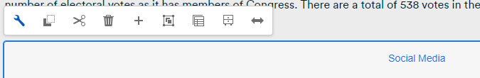
1. With the edit wrench, open the component.
Authoring Dialog
a. Title: Enter a Title for the Socia Media Component
b. Title Heading Level: Use the dropdown to select the Heading Level Style
c. Social Channel Selection
- Use Dropdown to select different type of social channel icons
- Enter Hover Text/Tooltip text into the field
- Enter the Social channel URL
- Select the "Add" button to add another social channel
d. Description: Enter supporting text for Socia Media component
e. Accessibility Label: Enter text for accessibility label


Social Media examples
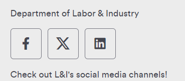 Figure A: Social Media component as it appears on a page.
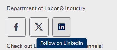 Figure B: Social Media component with user hovering over the LinkedIn icon. A tooltip appears upon hover.
Accessibility
New accessibility fields were added to the Social Media Component. Digitial Directors now have the ability to distinguish their authored social media links from the ones in the footer.
New required field in AEM for Social Media component: Accessibility Label
This will allow Digital Directors to author an accessible label for the link (currently, they are only able to author the tooltip).
- The accessible label field should indicate the agency name for the given social media page. For example, "Department of Insurance".
- The tooltip label should indicate the social media platform. For example, "Facebook".
- Tooltip: Identify social media icons with agency names to distinguish them from footer icons (e.g., "Facebook - Agency Name")
Other Tips
1. Use the Emulator widget to test Social Media size on different devices.
2. When clicked, Social Media links open in a new tab.
3. Keep hover text short.
4. Hover text may describe the icon (ex. “Email newsletter”). It may be more effective when it describes an action (ex. “Sign up for our newsletter!”).
5. Any content author may add the Social Media component to a page and edit. Only admin-level authors may edit the Footer’s Social Media component. Reference the Footer User Guide for more information.