
Overview
Component name: Quick Search
Authors who can use: any author can edit placeholder text
Templates/page types that can use component: required on some templates:
- Quick Search is baked into all pages as part of global navigation in the Header (uneditable; no placeholder text)
- Quick Search may be added to the Homepage template's Hero
- Quick Search may not be added to other templates
Required or optional: required on some templates
Authoring Fields
Adding the Quick Search component to the page
Pages that will use Quick Search already have the component baked into the template. If a page does not have Quick Search, it should not be added.
Editing the Quick Search component
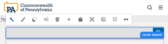
1. With the edit wrench, open the component.
1. Properties tab
a. "Is search component in header section?" checkbox: Check off if the Quick Search is in the Header Experience Fragment. Leave unchecked otherwise. Default unchecked.
b. Redirection Path field: Enter the page which search should redirect to, and which residents will land on if they select the search icon with no text entered.
2. Styles tab
a. Size dropdown: Select the size of the Quick Search component. Options are None, Small, and Large. The default is None, which is interchangeable with Small.
Accessibility
- There are no accessibility details for the Quick Search component.
Other tips
- Use the Emulator widget to test Quick Search size on different devices.
- Placeholder text should be short suggestions of what the user can search for.
- When selecting size, small will be more commonly used. Large size should only be used when there is a lot of space to work with on the page.
- Recent searches display as the resident begins typing.