
Overview
Component name: Modal
Authors who can use component: Admin only
Templates/page types that can use component: all as part of Header; otherwise use is restricted- ask Sapient if a Modal is needed
Required or optional: required as part of Header
Authoring Fields
Adding the Modal component to the page
The Modal is currently only available in the Experience Fragments section for the Header.
1. Once on the desired page in Edit mode, add the Modal by doing the following:
a. Option 1- double click on “Drag components here.” A modal titled “Insert New Component” will pop up. Type “Modal” in the search bar, or scroll to the Modal in the list. Double click to add to page.
b. Option 2- on the left hand rail, navigate to the Components tab. Type “Modal” in the search bar, or scroll to the Modal in the list. Double click to add to page.
Editing the Modal component
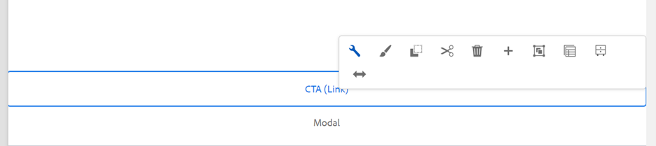
1. With the edit wrench, open the component.
2. Modal Name field: Enter a name for the Modal. It will be used to reference the Modal when authors want to add it to a page. It will not visually display on the Modal.
3. Icon field: Enter the name of an icon from Remix. Icons are optional. Reference the Using Icons guide for more info.
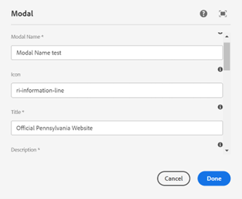
4. Title field: Enter a title for the Modal. The title will display on the Modal.
5. Description field: Enter a description for the Modal. The description will display on the Modal.
6. Link/Button Style Selector multifield: Add 1-2 calls to action for the resident to take upon opening the Modal.
a. CTA Label field: Add a label to appear on the CTA.
b. CTA Link field: Add a link for the CTA. When clicked, the resident will be led to this link. The link may be internal or external. CTA Link is optional.
c. CTA Icon field: Enter the name of an icon from Remix. Icons are optional.
d. CTA Type dropdown: Select Primary CTA for the first CTA added. If adding a second CTA, select Secondary CTA.
7. Click “Done” to save the Modal.
8. If adding a Modal to the Header, reference the Header Experience Fragment User Guide. If adding a Modal to a page, continue below. Note that adding Modals to pages is currently disabled.
9. Add a CTA (Link) component to the page. The CTA, when clicked by the end user, will open the Modal created in Steps 1-7.
10. With the edit wrench, open the component.
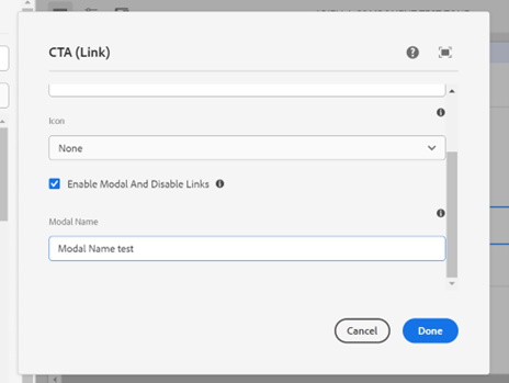
11. Label field: Add a label to appear on the CTA.
12. Skip the Link field.
13. Icon dropdown: Select an icon to appear on the CTA. Icons are optional.
14. Enable Modal And Disable Links checkbox: Check this box.
15. Modal Name field: Add the Modal Name as written in Step 2.
16. Click “Done” to save the CTA.
17. The CTA now appears on the page.
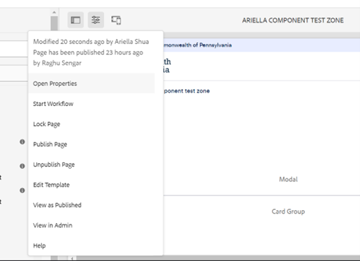
18. Navigate to the 3 dots in the top navigation bar. From the dropdown, select “View as Published.” The page will not publish upon selection; it shows an example of how it will look.
19. From the View as Published page, click the CTA. The Modal created will now display.

Accessibility
- For keyboard users, selecting “Enter” or “Space” should launch the Modal. It can be closed by clicking on the close icon or pressing “Esc.”
- Keyboard focus remains trapped in the dialog until it is closed. When navigating by keyboard, “Tab” and “Shift-Tab” do not move the focus outside of the Modal.
Other tips
- Use the Emulator widget to test Modal size on different devices.
- Test Modals as they’ll appear in publication through the View as Published option. Do not use the Preview option, as CTAs that are Modals do not open in this view.
- Residents can close the Modal by clicking the icon in the top right corner, or by clicking the Modal’s CTA(s).
- A Modal should only be used as a form of notification if it provides the resident with critical information immediately related to their task. For non-critical messaging, consider using an In-Page Alert.
- The current functionality of Modals does not save user information. Acknowledgements such as “I agree” are not saved by the system.
- When writing Modal text, clearly describe the action being confirmed and explain any potential consequences that it may cause. Both the title and the CTA should reflect the action that will occur.