
Overview
Component name: List
Authors who can use: all
Templates/page types that can use component: all
Required or optional: optional
Authoring Fields
Adding the List component to the page
- Once on the desired page in Edit mode, add the List component by doing the following:
- Option 1- double click on “Drag components here.” A modal titled “Insert New Component” will pop up. Type “List” in the search bar, or scroll to the List in the list. Double click to add to page.
- Option 2- on the left hand rail, navigate to the Components tab. Type “List” in the search bar, or scroll to the List in the list. Double click to add to page.
Editing the List component – manually authored List
This List is manually authored. The author must add/remove each List item by editing in the authoring dialog.
- With the edit wrench, open the component.
- General tab
- Teaser Details fields
- List Title field: Optionally add a title to appear above the List.
- Title Heading Level dropdown: Select the heading level of the title, between H2-H6.
- Display Size of Title dropdown: Select a size for the Title display.
- Description field: Optionally add a description to appear above the List. This may contain context on the List entries and purpose.
- CTA Label field: Optionally add a CTA to appear above the List. The label here is the text that will appear on the CTA.
- CTA Link pathfinder: When the resident clicks the CTA, they will be led to this link. Link may be internal or external..
- List Link Type dropdown: Select either Internal/External Link, Phone Number, Email, or SMS Message.
- List Columns selector: Select between 1-4 columns to display.
- Teaser Details fields
- List Details tab
- List Type dropdown: Select whether the List should include images, icons, or neither. Default: None.
- Default List fields
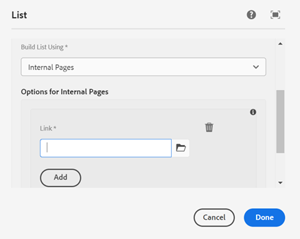
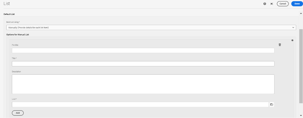
- Built List Using dropdown: Select whether the List should be built internally or manually. Default: Internal.
- Internal Pages: All List links will be pages pulled from AEM.
- Manually (Provide details for each list item): All List links will be added manually, as some may be external or need additional context.
- Recently Updated Pages: see next section on dynamic Lists.
- Recent Press Releases: see next section on dynamic Lists.
- If building internal List
- Add multifield: Click Add for every item that will display in the List.
- Link pathfinder: Use the pathfinder field to navigate to a page within AEM that should display in the List. The page title will appear on the List. If Image or Icon was selected in Step 3.1, and the page has an image or icon in its Page Properties, those will display as well.
- Add multifield: Click Add for every item that will display in the List.
- Title field: Add a title for each List entry.
- Pre-title field: Optionally add a pre-title to appear above the title.
- Description field: Optionally add a description for each List entry.
- List Link Type dropdown: Select either Internal/External Link, Phone Number, Email, or SMS Message.
- Link pathfinder: Add a link for each List entry. Links may be internal or external. For internal links, use the pathfinder field to navigate to the page within AEM that should display in the list.
- Language code: Add the code for the language that you are configuring the content. This code helps the users using a screen reader for accessibility.
- Image List only- image fields
- Leading Image: Drag and drop from the side rail, or browse for an image to upload.
- Decorative image – no alternative text checkbox: Images which don’t convey additional meaning do not require alternative text for accessibility. Default: unchecked. When unchecked, enable the below fields:
- Alternative text for accessibility field: Add alternative text.
- Inherit from description of asset checkbox: If selected image already has alternative text defined in Assets, use this text. If unchecked, the “Alternative text for accessibility” field will be enabled. Default: unchecked.
- Icon List only- icon fields
- Leading Icon: Enter an icon from the Remix Icon library: https://remixicon.com . Reference Using Icons user guide for more detail.
- Divider checkbox: When checked, show a line between each List item. Default: checked.
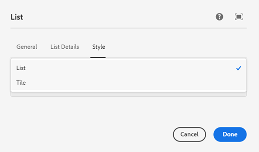
6. Style tab
1. List Style dropdown: Select whether the List should display as a regular List, or in Tile format. Note that Tiles only contain the title and icon/images; no other text will appear. Default: List.
2. Remove Padding dropdown: Select whether bottom padding should display (None) or be removed (Remove Bottom Padding). Default None.
Editing the List component – dynamically authored List
This List is dynamically authored. The author must select a parent page, and the List will update itself when child pages are created or modified.
- With the edit wrench, open the component.
- General tab - no changes from above.
- List Details tab
- List Type dropdown: Select whether the List should include images, icons, or neither. Default: None. None is the best option for dynamic Lists.
- Built List Using dropdown: Select whether the list should be built internally or manually. Default: Internal.
- Internal Pages: see prior section on manual Lists.
- Manually: see prior section on manual Lists.
- Recently Updated Pages (dynamically updated): Lists pages that have been created and published, or modified and published.
- Recent Press Releases (dynamically updated): Lists pages that have been created and published based on their date in Page Properties.
4. If building Recently Updated Pages List
1. Parent Page Folder Link pathfinder field: Enter the link to the parent page. Child pages under the parent will populate the List.
2. Number of List Items field: Enter the number of items to display in the List, between 2-10.

5. If building Recent Press Releases List
1. Parent Page Folder Link pathfinder field: Enter the link to the parent page. Child pages under the parent will populate the List based on each page’s date in Page Properties, displaying in reverse chronological order.
1. In Page Properties, this is the date picker field “Date of Press Release,” which is found in the CoPA tab. Reference Agency News Article user guide for more info.
2. Number of List Items field: Enter the number of items to display in the List, between 2-10.
6. Divider checkbox: When checked, show a line between each List item. Default: checked.


6. Style tab – no changes from above.
7. Publish the page. Dynamic Lists are best viewed in publish mode. They may take several minutes to refresh as changes are pushed live.
1. If unable to publish, use the Publish to Preview workflow. See Workflows user guide for more info.
8. When a child page is created/modified, and then published, the page will automatically jump to the top of the List (dependent on Page Properties for Recent Press Releases).
Accessibility
- There are no specific accessibility notes for the List component.
Other tips
List authoring tips
- List images look best at the following ratio/size: 1:1, 600x600 px
- Use the Emulator widget to test List size on different devices.
- Dynamic and internal Lists show the Navigation Titles field from Page Properties, if authored.
- If not authored, Title field shows.
- Dynamic Lists should be text only; no image or icon should be added in authoring dialog.
- Keep content clear and concise so items are scannable to residents. Supporting text should span about two lines.
- Order List items in a logical way, such as alphabetical or numerical.
- Use icons, text, and actions in a consistent format across a List.
- Lists work best to organize several related pieces of copy and content, while taking up less space than a Card Group.
- Use Lists to help residents find a specific item and act on it.
- It is recommended for authors to add the Recent Press Releases List to their Agency Landing Page, though it may be added elsewhere.
List component examples
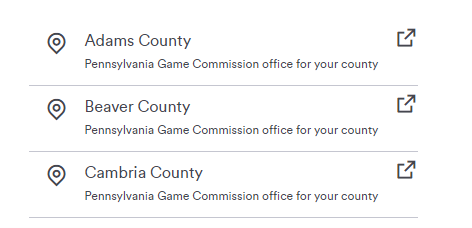 Figure A: Manually authored icon List.
 Figure C: Internally authored List – neither icon nor image.
 Figure E: Recently Updated Pages List – neither icon nor image.
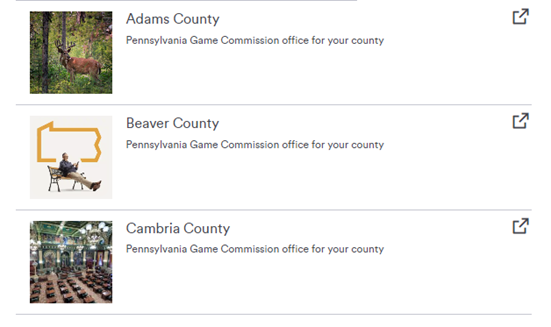 Figure B: Manually authored image List.
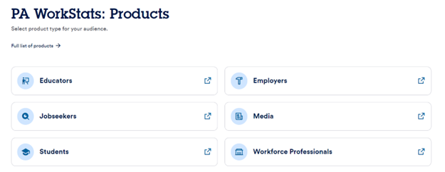 Figure D: Internally authored icon List, set to Tile style.
 Figure F: Recent Press Releases List, set to Tile style.