
Overview
Component name: CTA Link
Authors who can use: all
Templates/page types that can use component: all
Required or optional: optional – generally part of another component; shouldn't be on its own
Authoring Fields
Adding the CTA Link component to the page
1. While it is possible to add the CTA Link component to the page independently, this is not typically recommended. CTA Link is an optional field of other common components (Teaser, Hero) and will be added to the page with them.
2. If it is necessary to add CTA Link on its own:
a. Once on the desired page in Edit mode, add the CTA Link by doing the following:
i. Option 1- double click on “Drag components here.” A modal titled “Insert New Component” will pop up. Type “CTA Link” in the search bar, or scroll to the CTA Link in the list. Double click to add to page.
ii. Option 2- on the left hand rail, navigate to the Components tab. Type “CTA Link” in the search bar, or scroll to the CTA Link in the list. Double click to add to page.
Editing the CTA Link component
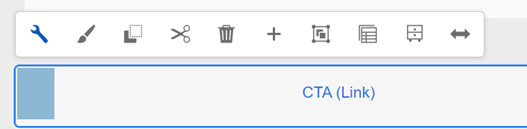
1. With the edit wrench, open the component.
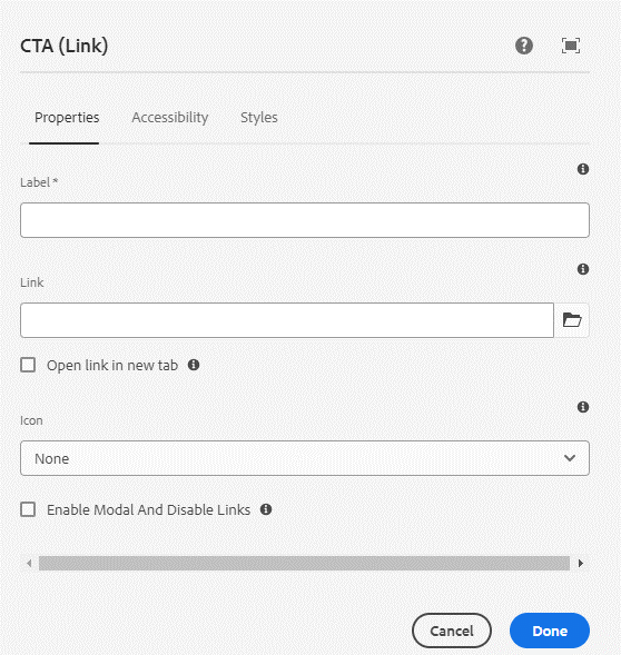
2. Properties tab
a. Label field: Add a label for the CTA. This is the text that will appear on the Button (ex. “Click here”).
b. Link field: Add a link for the CTA. When clicked, the user will be led to this link. The link may be internal or external.
i. Use the folder to select an internal link.
ii. Copy/paste an external link.
c. Open link in new tab checkbox: Check this box if the link is external, leading off of AEM. Default unchecked.
d. Icon field: A trailing icon may be added to the CTA. Select from the list. Icons are optional. See Using Icons user guide for more info on icons in AEM.
e. Enable Modal and Disable Links checkbox: If using a CTA to prompt a Modal, use the checkbox. See Modal user guide for details. Default unchecked.
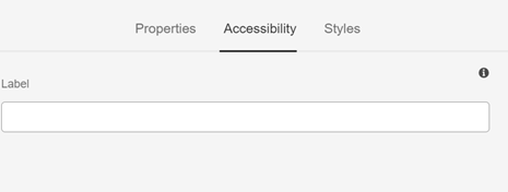
3. Accessibility tab
a. Label field: Optionally add an ARIA label attribute for the CTA Link. Useful if the visual Button text is not very descriptive. Ideally, this field should be avoided and vague CTAs like “Learn More” should be avoided. All CTAs should have descriptive labels.
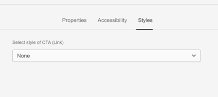
4. Styles tab
Select style of CTA (Link) dropdown: There are 3 style options from the dropdown. The default selection, None, will show as Primary style.
a. Primary CTA (Link)
i. Primary buttons have high visual impact, and should be used for important, final actions that complete a flow, like Save or Confirm.
ii. Only one CTA Link in a group should be in Primary style. Any others should be Secondary or Ghost.
b. Secondary CTA (Link)
i. Secondary buttons are medium-emphasis buttons. They contain actions that are important, but aren’t the primary action in a digital experience.
c. Ghost CTA (Link)
i. Ghost buttons are used for the lowest priority actions, especially when presenting multiple options. Ghost buttons can be placed on a variety of backgrounds. Until the button is interacted with, its container isn’t visible.
CTA Link examples
 Figure A: Sample CTA Links in a group, with all three styles represented. Note that CTAs should not be stacked in such a manner; this is an example only.
Accessibility
- For keyboard users, CTA Links can be reached by Tab and selected with Space or Enter.
- For examples of accessible labels, see the WCAG Content Guidelines.
Other Tips
- Do not stack CTAs.
- Use the Emulator widget to test CTA Link size on different devices. Note that CTA Links scale and may take up the width of the screen on smaller devices (mobile/tablet).
- It is often recommended to add CTA Link through other components, rather than on its own (ex. Teaser). The component display is the same, but it will be part of the other component’s authoring dialog.
- Do not use two high-emphasis (Primary style) CTAs in a button group.
- Make sure CTA labels are unique and descriptive. They should provide insight into the action that will be taken (ex. “Submit form” or “Read article”). Labels like “Click here” and “Read more” don’t provide context, especially for screen reader users.