
Overview
Component name: Container
Authors who can use: any
Templates/page types that can use component: root Containers are required on all templates; additional Containers are optional
- Root Containers which are baked in to templates include:
- Hero section Container
- Main content Container
- Bottom content Container (full width)
- Additional Containers may be optionally added
Required or optional: root required on all templates; additional optional
Authoring Fields
Adding the Container component to the page
1. All pages already have Containers on the template by default.
2. If additional Containers are needded:
a. Once on the desired page in Edit mode, add the Container component by doing the following:
i. Option 1- double click on “Drag components here.” A modal titled “Insert New Component” will pop up. Type “Container” in the search bar or scroll to Container in the list. Double click to add to page.
ii. Option 2- on the left handrail, navigate to the Components tab. Type “Container” in the search bar, or scroll to Container in the list. Double click to add to page.
Editing the Container component
1. With the edit wrench, open the component.
2. Properties tab
a. Background Image field: The author has the ability to author a background image within the container. The author should limit the use of the background image in the Container component.
b. Label field: Authors need not add a label.
c. Role field: Authors need not add a role.
3. Styles tab
a. Container Background Width dropdown: Select None or Component Container. Default None.
i. Component Container option should be selected if the author doesn’t want the Container to stretch across the entire page. It will center the Container within the page.
b. Container Background Color dropdown: The colors are used to show prominence of the content across the UI. Select None if a background is not required. Default None.
i. Note that selected colors are also not tied to the name of the color. For example, Surface Container High displays as a light blue, but is not referred to as light blue. This is done because the colors are set as color tokens, so if they need to be updated in the future they can be changed with one simple switch of the color token.
ii. Figure C below shows each background color option.
c. Container Border dropdown: Add a rounded border to the Container. Choose between None, Container Border Radius (2 rem), or Container Small Border Radius (1 rem). Default None.
d. Padding Top/Bottom dropdown: Add extra padding to the Container. Choose between None, Top, Bottom, or Top and Bottom. Default None.
e. Padding Left/Right dropdown: Add extra padding to the Container. Choose between None, Right, Left, or Left and Right. Default None.
f. Section Types dropdown: Authors should leave the selection at None.

Accessibility
- When a Container is added to the page, the component name is “Container.” When a Container is already baked into the page, the component name is “Container [Root].” Authors can edit both the same way.
Other tips
- Use the Content Tree from the side toggle to view all components grouped by Container. Click the edit wrench on each item to jump to that component and open its authoring dialog.

- On the Homepage, PA Gov Content, and Search Results page templates, the root Containers are set at full width. To edit, select the Styles tab in the authoring dialog, and change Container Background Width from None to Component Container.
- On the other Agency Content, Agency News Article, and Service Detail page templates, the root Contianers vary in width. In the main body content section, the root is set at Component Container width (centered on the page). In the bottom content section, the root is set at None (full width). Both may be edited as described above.
- The full width root Container on the bottom of pages has a limited component library. The main body content root Container, and any additional Containers added to the page, have the full component library.
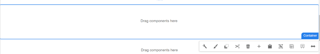
Sample Containers
 Figure A: Two root Containers: the Hero Container and the body content Container.
 Figure B: Two root Containers: the body content Container and the bottom section full width Container.
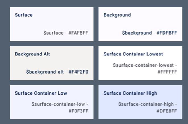 Figure C: Container background color options.