
Overview
Component name: Column Control
Authors who can use: any
Templates/page types that can use component: all
Required or optional: optional

Authoring Fields
Adding the Column Control component to the page
1. Once on the desired page in Edit mode, add the Column Control component by doing the following:
a. Option 1- double click on “Drag components here.” A modal titled “Insert New Component” will pop up. Type “Column Control” in the search bar, or scroll to the Column Control in the list. Double click to add to page.
b. Option 2- on the left hand rail, navigate to the Components tab. Type “Column Control” in the search bar, or scroll to the Column Control in the list. Double click to add to page.
Editing the Column Control component
1. With the edit wrench, open the component.
2. General tab
a. Layout Style dropdown: The author can select the following options for the page layout:
i. 2 columns 50/50
ii. 2 columns 25/75
iii. 2 columns 75/25
iv. 3 columns 33/33/33
v. 3 columns 25/25/50
vi. 3 columns 50/25/25
vii. 3 columns 25/50/25
viii. 4 columns 25/25/25/25
The layout styles will break the page into columns. Once the layout is selected, the author will see a parsys for each column where components can be added. For example, if the 2-column 25/75 is selected, the first column will take up 25% of the page, and the second column will take up 75% of the page.
A parsys is the blue highlighted area on the template where a component can be added – similar to a Container. It highlights to show where the component can be added.
c. First Column:
d. Second Column:
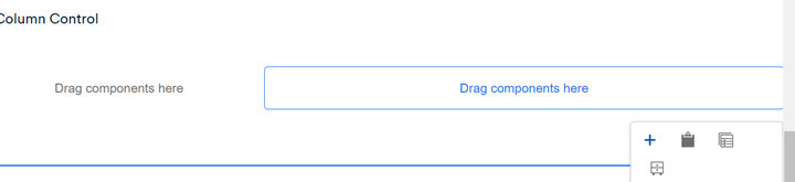
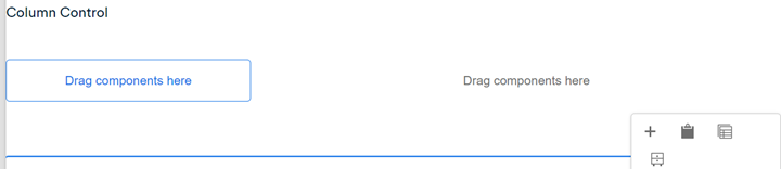
Column Control examples
 Figure A: Two-column, 50/50 Column Control.
 Figure B: Three-column, 25/50/25 Column Control.
Accessibility
- There are no specific accessibility notes for the Column Control component.
Other tips
- Use the Emulator widget to test Column Control size on different devices.
- Components are not blocked from being added to the Column Control. However, it is not recommended to add large components to the smaller columns of the Column Control. For example, the Teaser component should not be used in a column that is less than 50% of the page.
- When added to the page, the text “Column Control” appears above the component. This will show in both Edit and Preview mode. To see the page without the text, navigate to View as Published mode (this will not publish the page, but shows how it will look when published).
- Column Control should be used to build the “Related Services and Information” section of the Service Detail template, if authoring. Go to the Service Detail user guide for more info.