
Overview
Component name: Accordion
Authors who can use: All
Templates/page types that can use component: All
Required or optional: Optional
Authoring Fields
Adding the Accordion component to the page
Once on the desired page in Edit mode, add the Accordion by doing the following:
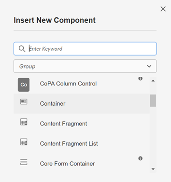
Option 1: Double click on “Drag components here.” A modal titled “Insert New Component” will pop up. Type “Accordion” in the search bar, or scroll to the Accordion in the list. Double click to add to page.
Option 2: On the left hand rail, navigate to the Components tab. Type “Accordion” in the search bar, or scroll to the Accordion in the list. Double click to add to page.
Editing the Accordion component
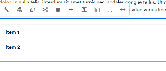
1. With the edit wrench, open the component.
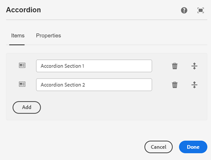
2. Items Tab
- “Item 1,” “Item 2” fields: The author can edit the title of the Accordion sections.
- Add button: The author can use the search to add more sections to the Accordion. For example, the author may select the Container component. There are two Container components added by default while authoring the Accordion (these are "Item 1" and "Item 2"). Text or other components may be placed within.
- Any new section must have a title.
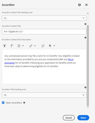
3. Properties tab
- Accordion Context Title Heading Level: Select heading level for the title above the Accordion, from H2-H6.
- Accordion Context Title: Add a title to display above the Accordion.
- Accordion Context Short Description: Add a description to display above the Accordion.
- Accordion Title Heading Level: Select heading level for each item in the Accordion, from H2-H6.
- Open Accordions checkbox: Set the Accordion to either have all tabs default expanded or collapsed. Default unchecked.
4. Select ‘Done’ to save the authoring changes.
5. There are two ways to edit the items in each Accordion tab.
Option 1: From the edit toolbar, select the Select panel button (three boxes with a checkmark). This opens each tab for editing.
Option 2: From the authoring dialog, click the Open Accordions checkbox. This opens each tab for editing, and will show the tabs open by default once published.
Accordion examples
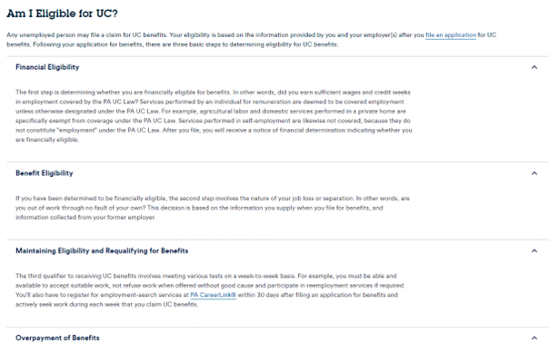 Figure A: Accordion with tabs expanded.
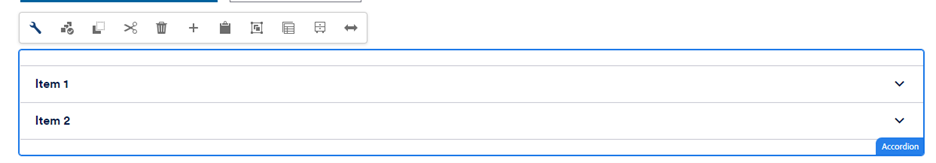
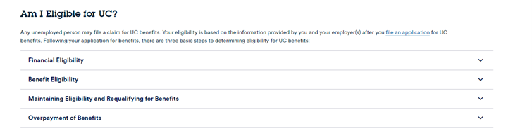 Figure B: Accordion with tabs collapsed.
Accessibility
Ensure that the heading level of the Accordion title, and of each Accordion tab, is set according to the rest of the page’s hierarchy.
Other tips
- Use the Emulator widget to test Accordion size on different devices.
- Accordions are used to organize related information and to reduce scrolling when content is not crucial.
- As Accordions hide content, it’s important to recognize that residents may not notice or read all tabs. If a resident is likely to need and read all content, don’t use an Accordion — use a regular page with clear section headers.
- Residents can expand and collapse individual Accordion tabs by clicking the chevron at the right of each tab.
- The title of each Accordion tab should be brief while still being clear and descriptive. Content within each Accordion tab may be longer — it can be split into paragraphs and include sub-headers if needed.